[ad_1]
BTDTGTTSAWIO. Oh, you didn’t follow that? It’s an internet acronym! Don’t you know what it stands for? I can’t believe I’m the one telling you this: “Been there, done that, got the T-shirt and wore it out,” of course!
If you are confused, you aren’t the only one. Back in 2014, the FBI shared an 80-page glossary of 2,800 internet slang acronyms, as the result of a Freedom of Information Act request. It was a list built for agents to translate internet speak. And in a worst-case scenario of bureaucracy, that list was full of nonsensical, rarely used acronyms—either the result of too much research diligence, or not enough. Now, the design firm Pentagram has paid that list its full due.
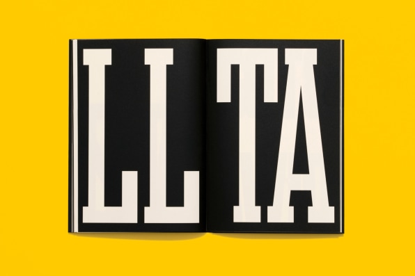
For their beloved annual holiday mailer, Pentagram partners Michael Bierut and Matt Willey together with project lead Britt Cobb, reimagined that list as a hilarious booklet, which pays homage to the FBI’s cringe list of internet slang.
“Because this thing measures about 4″x6″ there’s the idea that every agent could have it in his or her pocket when encountering some baffling communication,” says Bierut with a laugh. “They could pull it out and quickly decipher what kind of skullduggery is going on.”
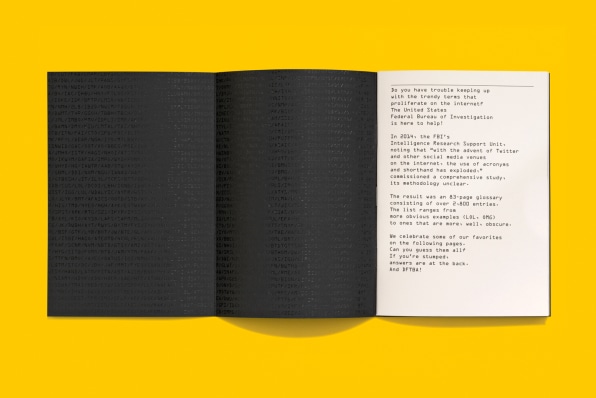
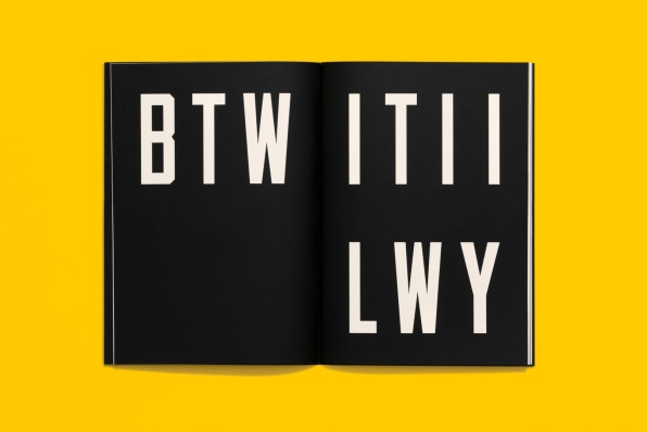
In an overly serious black and white presentation, the booklet parses acronyms like IITYWTMWYBMAD (“If I tell you what this means will you buy me a drink?”) in all caps. A glossary lives in the back where you can find the definitions, which is helpful, since auditing has proven that many of these acronyms have only been uttered online a few dozen times. And most of them are silly.
“Not a single one of the acronyms stands for ‘You put the bomb under the second to last seat on the bus,’” says Bierut. “It’s all shit like ‘rolling on the floor laughing.’”
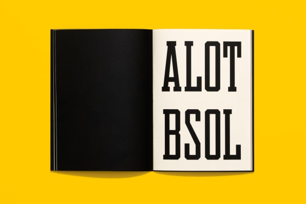
The team was inspired by the large “FBI” label on the back of agents’ jackets. Instead of curves, the letters feature unique, chamfered corners—edges cut at a blocky, 45-degree angle. Willey paid homage to this lettering with two custom typefaces that are meant to convey the FBI as a clueless bureaucracy, which make their way somewhat interchangeably through the booklet. The names of those typefaces—Edgar Sans and Clyde Slab—reference the FBI’s first director J. Edgar Hoover and his second-in-command (and alleged lover) Clyde Tolson.
But while real FBI jackets are in blue and yellow, Beirut and team realized those colors didn’t really work the same way in print as they do for the FBI IRL.
“If you use those colors, it just feels too pretty, or too much like the Knicks or the Mets or something,” says Bierut. Instead, the team stripped the color away, to give the booklet the feel of a government document before redaction. “We decided to make it progressively more hardcore and dead serious, to make the acronyms feel more preposterous.”
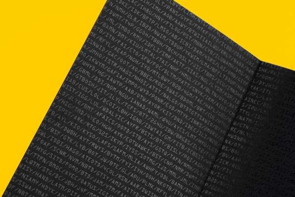
The visual joke worked, but the pamphlet felt a bit too plain in two colors. So late in the project, the team added a black-on-black gatefold cover to the inside, listing as many acronyms as they could fit on the page. The stark sheen of its gloss foil stamping adds a certain panache to a project that otherwise may have felt more like a stapled printout.
“When I talked about it with Britt, I said I wanted to go for that ‘Beautiful Mind’ vibe,” says Bierut, “sort of mysterious and obsessive—and borderline crazy.”
Pentagram isn’t selling the books. But if you’d like to acquire a copy of your own, Pentagram will send one your way if you make a donation to the Electronic Frontier Foundation (EFF), the nonprofit organization that champions digital rights and privacy. You can find more information on Pentagram’s site.
[ad_2]
Source link


